
Crafting your website’s navigation menu might seem simple at first glance, but it plays a bigger role than you think. Over half of global web traffic now comes from mobile devices, yet many menus still frustrate users and chase them away. There is a smarter way to build navigation, and it starts with ditching complexity and putting clarity first.
Table of Contents
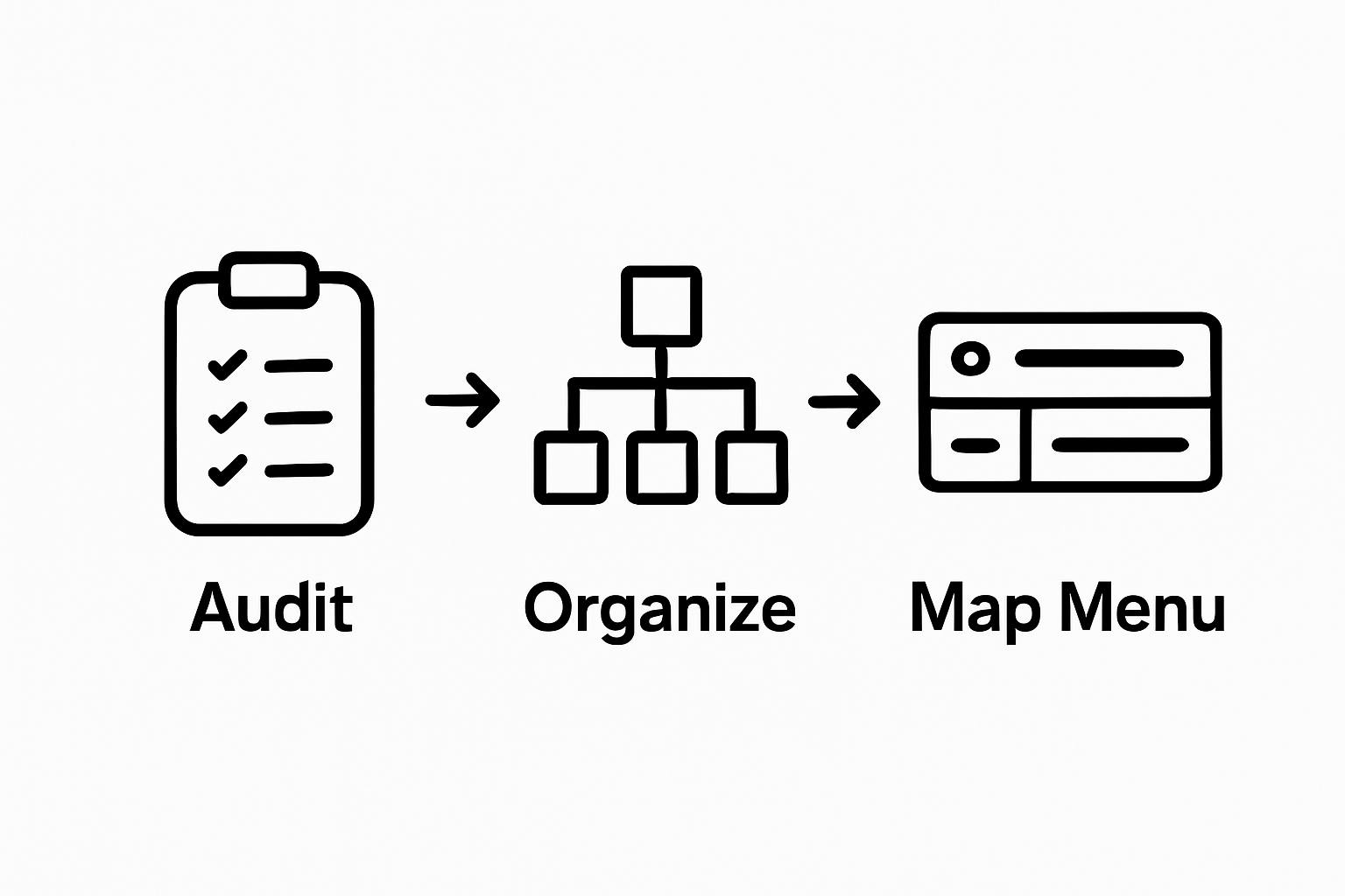
- Step 1: Define Your Menu Structure And Content
- Step 2: Choose A Menu Design Style That Fits
- Step 3: Implement The Navigation Menu Using Html/Css
- Step 4: Optimize For Mobile Responsiveness
- Step 5: Test Your Navigation Menus For Usability
- Step 6: Update And Maintain Your Navigation Menus Regularly
Quick Summary
| Key Point | Explanation |
|---|---|
| 1. Create a clear menu structure | Organize content logically to guide users effectively through your website, ensuring easy access to key information. |
| 2. Prioritize clarity in labels | Use straightforward language for menu items to improve user understanding, avoiding confusing terminology. |
| 3. Implement responsive design | Utilize media queries and flexible layouts to ensure your navigation functions well on all devices and screen sizes. |
| 4. Conduct usability testing | Test the navigation menu with real users to identify areas of confusion and improve overall user experience. |
| 5. Regularly update the menu | Review and optimize your navigation to reflect changes in content and user expectations to maintain engagement. |
Step 1: Define Your Menu Structure and Content
Creating an effective navigation menu begins with strategic planning and thoughtful organization. The menu structure serves as the backbone of your website’s user experience, guiding visitors intuitively through your digital space. Before diving into design details, you need to map out a clear, logical pathway that connects your most important content.
Start by conducting a comprehensive content audit of your website. List every significant page and section, then categorize them into primary groups that represent your site’s core purpose. For a blog or magazine website, this might include categories like Home, Articles, Featured Content, About, and Contact. Consider the primary user journey: what do visitors want to find most quickly?
According to Yale University’s Usability & Web Accessibility group, conventional menu placement and clear navigational styles are crucial for user engagement. Your menu structure should provide multiple pathways to key information, ensuring visitors can reach their desired content with minimal clicks.
As you draft your menu, prioritize clarity and simplicity. Avoid overwhelming users with too many options. A general rule of thumb is to limit primary navigation items to 5-7 categories. If you have extensive content, consider using dropdown submenus to organize secondary pages without cluttering the main navigation. Each menu item should represent a broad, meaningful category that logically groups related content.
Carefully evaluate the descriptive labels for each menu item. Use clear, concise language that immediately communicates the content users will find. Avoid clever or cryptic terminology that might confuse visitors. Words like “Insights” are less clear than “Articles” or “Blog”. Your goal is to create an intuitive roadmap that helps users understand your website’s structure at a glance.
Before finalizing your menu structure, test it with potential users or colleagues. Ask them to navigate through your proposed menu and provide feedback. Can they quickly understand where to find specific types of content? Does the menu flow logically? This user-centered approach will help refine your navigation design and create a more engaging website experience.
Step 2: Choose a Menu Design Style That Fits
Selecting the right menu design style is more than a visual choice it is a critical user experience decision that directly impacts how visitors interact with your website. Your navigation menu should not only look appealing but also function seamlessly across different devices and screen sizes. The design you choose must align with your website’s purpose, brand identity, and target audience’s expectations.
Contemporary web design offers several primary navigation styles. The horizontal top menu remains the most traditional and widely used approach, placing menu items in a single line across the top of the page. This style works exceptionally well for websites with fewer menu categories and provides immediate visibility. For content-rich sites like blogs and magazines, this design ensures quick access to primary sections without overwhelming users.
According to Big Sea’s web design recommendations, making parent pages clickable provides a more intuitive navigation experience. This means visitors can either drop down into subcategories or directly access the main category page, creating a more flexible user journey.
Alternative menu designs include hamburger menus for mobile responsiveness, vertical sidebar menus for more complex site structures, and mega menus that display extensive subcategories in a comprehensive dropdown format. Each style offers unique advantages depending on your content volume and website goals. The hamburger menu, represented by three horizontal lines, saves screen space on mobile devices while keeping navigation clean and uncluttered.
When selecting your menu design, consider critical factors like readability, responsiveness, and user accessibility. Ensure that menu items are legible on all devices, with sufficient contrast and appropriately sized touch targets for mobile users. Typography plays a crucial role choose fonts that are clean, professional, and easy to read across different screen resolutions.
Test your chosen menu style rigorously. Validate its performance by navigating through your site on multiple devices desktop, tablet, and smartphone.
Below is a comparison table of the main website navigation menu design styles discussed in the article, summarizing their key features and best use cases.
| Menu Style | Description | Best For | Key Advantage |
|---|---|---|---|
| Horizontal Top Menu | Menu items in a single line across the top | Sites with fewer categories | Immediate visibility |
| Hamburger Menu | Collapsible menu found behind a three-line icon | Mobile devices and small screens | Saves screen space |
| Vertical Sidebar | Menu items stacked vertically along a page side | Complex site structures or many sections | Accommodates more categories |
| Mega Menu | Large dropdown showing extensive subcategories | Content-rich websites, e-commerce | Comprehensive overview |
Step 3: Implement the Navigation Menu Using HTML/CSS
Transforming your menu structure into a functional web interface requires strategic HTML and CSS implementation. This step bridges your conceptual design with a tangible, interactive navigation system that communicates your website’s structure clearly and professionally.
Begin by creating a semantic HTML structure that represents your menu hierarchy. Use the nav element as a container, which signals to browsers and screen readers that this is a primary navigation section. Inside the nav element, construct an unordered list ul with list items li representing each menu category. This approach provides a clean, accessible foundation for your navigation.
According to MDN Web Docs, modern CSS Flexbox offers powerful layout capabilities for creating responsive navigation menus. Implement Flexbox properties to control menu item alignment, spacing, and responsive behavior. Use display: flex on your nav ul to create a horizontal layout, and flex-direction: row to ensure items are positioned side by side. For mobile adaptability, you can easily switch to flex-direction: column using media queries.
Style your menu items with careful attention to readability and user interaction. Define padding, margin, and font-size to create comfortable touch targets and legible text. Implement hover and active states using CSS pseudo-classes to provide visual feedback when users interact with menu items. A subtle background color change or underline can significantly enhance the user experience by confirming their interactions.
For dropdown or nested menus, use CSS position: relative on parent items and position: absolute on submenus. This technique allows you to create multi-level navigation without disrupting the page layout. Implement transition properties to add smooth animations when revealing submenus, making the interaction feel more dynamic and engaging.
Ensure your menu design remains responsive across different devices. Use media queries to adjust layout, font sizes, and interaction methods for mobile screens. On smaller devices, consider transforming your horizontal menu into a collapsible hamburger menu that expands when clicked. This approach maintains a clean interface while preserving full navigation functionality.
Finally, validate your implementation by testing the menu thoroughly. Check that all links work correctly, hover states function as expected, and the menu remains readable and usable across different browsers and screen sizes. A well-implemented navigation menu should feel intuitive, responsive, and seamlessly integrated with your website’s overall design.

Step 4: Optimize for Mobile Responsiveness
Mobile responsiveness is no longer an optional feature it is a fundamental requirement for modern websites. With over half of global web traffic originating from mobile devices, your navigation menu must function seamlessly across smartphones, tablets, and desktop computers. This step focuses on transforming your carefully designed menu into a flexible, adaptive interface that delivers an exceptional user experience regardless of screen size.
Start by implementing media queries, the cornerstone of responsive design. These CSS rules allow you to define different styling and layout configurations based on device characteristics. For navigation menus, create breakpoints that trigger specific layout changes. Typically, this means switching from a horizontal menu to a hamburger menu when screen width drops below 768 pixels. Use CSS max-width and min-width properties to precisely control these transitions.
According to the U.S. Department of Agriculture’s digital design guidelines, responsive design requires careful consideration of touch interactions. Ensure menu items have sufficient touch target sizes minimum 44×44 pixels for mobile screens. This prevents accidental clicks and improves overall usability. Increase padding around menu items and use generous spacing to create comfortable, error-resistant navigation zones.
Implement a collapsible mobile menu using JavaScript or CSS techniques. The popular hamburger icon (three horizontal lines) serves as a universal symbol for hidden navigation. When clicked, this icon should smoothly reveal a full-screen or sliding menu that displays all navigation options. Prioritize performance by using CSS transitions and transforms for smooth animations that feel native to the device.
Consider the hierarchy and readability of your mobile menu. Simplify complex multi-level menus for smaller screens. You might need to restructure dropdown menus into expandable sections or create a more linear navigation flow. Use clear, legible typography with sufficient contrast and avoid tiny font sizes that strain mobile users’ eyes.
Thoroughly test your responsive menu across multiple devices and browsers. Use browser developer tools to simulate different screen sizes, but also test on actual devices when possible. Pay attention to touch interactions, menu animations, and overall user experience. A well-designed mobile navigation menu should feel intuitive, allowing users to move through your site effortlessly with minimal friction.
Step 5: Test Your Navigation Menus for Usability
Usability testing transforms your navigation menu from a theoretical design to a user-validated interface. This critical step ensures that your meticulously crafted menu actually works the way you intend, providing real-world insights into how visitors interact with your website’s navigation system. Without comprehensive testing, even the most beautifully designed menu can become a frustrating barrier to user engagement.
Begin by conducting comprehensive cross-device testing. This means methodically checking your navigation menu’s performance on various devices smartphones, tablets, desktops, and different browser configurations. Use both physical devices and browser developer tools to simulate multiple screen sizes and resolutions. Pay close attention to how menu items scale, how dropdown menus function, and whether touch interactions remain smooth and intuitive across different platforms.
According to College & Research Libraries usability research, menu placement and visibility significantly impact user interaction. Recruit a diverse group of test participants representing your target audience. Ask them to complete specific tasks using your navigation menu, such as finding a particular page or section. Observe their interactions carefully, noting any moments of hesitation, confusion, or unexpected navigation patterns. Record time to complete tasks, number of clicks required, and verbal feedback to identify potential improvements.
Implement quantitative and qualitative testing methods. Use tools like heatmap tracking and click analytics to understand how users actually move through your navigation. These tools provide visual representations of user interactions, revealing which menu items attract the most attention and which might be overlooked. Supplement these insights with user interviews or surveys that capture subjective experiences and emotional responses to your navigation design.
Pay special attention to accessibility testing. Verify that your navigation menu works seamlessly with screen readers, can be navigated using keyboard controls, and meets web accessibility standards. Test color contrast, ensure proper semantic HTML markup, and confirm that all interactive elements are clearly defined and operable for users with different abilities.
Finalize your testing by creating a refinement checklist. Document any issues discovered during testing, prioritize them by impact, and systematically address each concern. A truly user-friendly navigation menu evolves through iterative testing and improvement, transforming user feedback into a more intuitive and engaging web experience.
Step 6: Update and Maintain Your Navigation Menus Regularly
Navigation menu maintenance is an ongoing process that ensures your website remains intuitive, relevant, and user-friendly. Websites are living ecosystems that evolve with your content, business goals, and user expectations. Neglecting your navigation menu can lead to confusion, reduced user engagement, and potentially lost opportunities.
Establish a quarterly review schedule to systematically evaluate your navigation structure. During these reviews, analyze website analytics to understand user behavior. Look for patterns such as pages with high bounce rates, sections rarely visited, or navigation paths that seem counterintuitive. These insights will guide your menu optimization strategy. Pay attention to metrics like time on page, click-through rates, and user flow to identify potential navigation improvements.
According to Yale University’s Usability & Web Accessibility guidelines, maintaining consistent navigation across all pages is crucial for user experience. As your website grows and changes, periodically audit your content to ensure menu categories remain accurate and comprehensive. This might involve adding new sections, removing outdated pages, or restructuring menu hierarchies to reflect your current site architecture.
Implement a content lifecycle management approach. When you add new content sections or remove existing ones, immediately update your navigation menu to reflect these changes. Be proactive about keeping your menu streamlined and relevant. Avoid cluttering your navigation with too many options, which can overwhelm users. If a section becomes less important, consider moving it to a footer menu or removing it entirely.
Technology and user expectations evolve rapidly, so stay informed about emerging navigation design trends. Attend web design conferences, follow industry blogs, and participate in user experience forums to keep your navigation strategy current. Consider conducting periodic user surveys or focus groups to gather direct feedback about your site’s navigation experience. This qualitative data can provide insights that pure analytics might miss.
Develop a navigation maintenance checklist that includes technical and design considerations.
The following table provides a maintenance checklist you can use to regularly review and update your website navigation menus, ensuring they remain effective and user-friendly.
| Task | Frequency | Purpose |
|---|---|---|
| Analyze user behavior/analytics | Quarterly | Identify usage patterns and improvement areas |
| Audit menu categories and labels | Quarterly | Ensure categories and labels remain accurate |
| Add/remove content sections | As needed | Keep navigation current with site changes |
| Check for broken links/redirects | Quarterly | Maintain functional navigation |
| Test mobile responsiveness | Quarterly | Ensure menu works across all device sizes |
| Gather user feedback | Yearly or Semiannually | Identify usability issues and user needs |
Frustrated by Difficult Navigation? Let Mow Simplify Your Website Experience
Creating the perfect navigation menu can often feel overwhelming. You want clarity and simplicity for your visitors, but balancing usability, mobile responsiveness, and regular maintenance is a real challenge. If you are struggling to organize your content, manage dropdowns, and ensure your menus are always up to date, you are not alone. Many website owners worry about losing users when menus become cluttered or confusing. Your audience deserves an intuitive, modern, and beautiful navigation structure that works on every device.

With the Mow WordPress Theme, you do not have to reinvent the wheel. Mow is built for content-rich blogs and magazines and comes with flexible menu options, pre-built layouts, and seamless mobile responsiveness. You can take control of your site’s user journey with ease, thanks to real-time customization and one-click import demos. Make your website stand out in 2025 by switching to a theme designed for clarity and growth. See all the powerful features and get started today on the official product page.
Frequently Asked Questions
How do I define the structure of my website’s navigation menu?
Start by conducting a comprehensive content audit, categorize pages into primary groups based on your site’s purpose, and aim to limit primary navigation items to 5-7 clear categories.
What design styles can I choose for my website’s navigation menu?
Consider various styles like horizontal top menus, hamburger menus, vertical sidebar menus, and mega menus. Choose a style that aligns with your website’s purpose and ensures usability across devices.
How can I make my navigation menu mobile responsive?
Implement media queries to adjust the layout for different devices, ensure touch targets are large enough, and consider using a collapsible menu like the hamburger menu for mobile screens.
What should I include in my usability testing for navigation menus?
Conduct cross-device testing to check performance, recruit diverse test participants to observe their interactions, and implement both quantitative analytics and qualitative feedback to refine the menu design.


